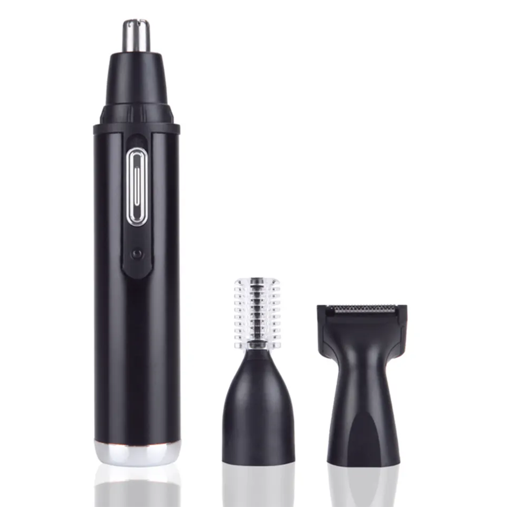
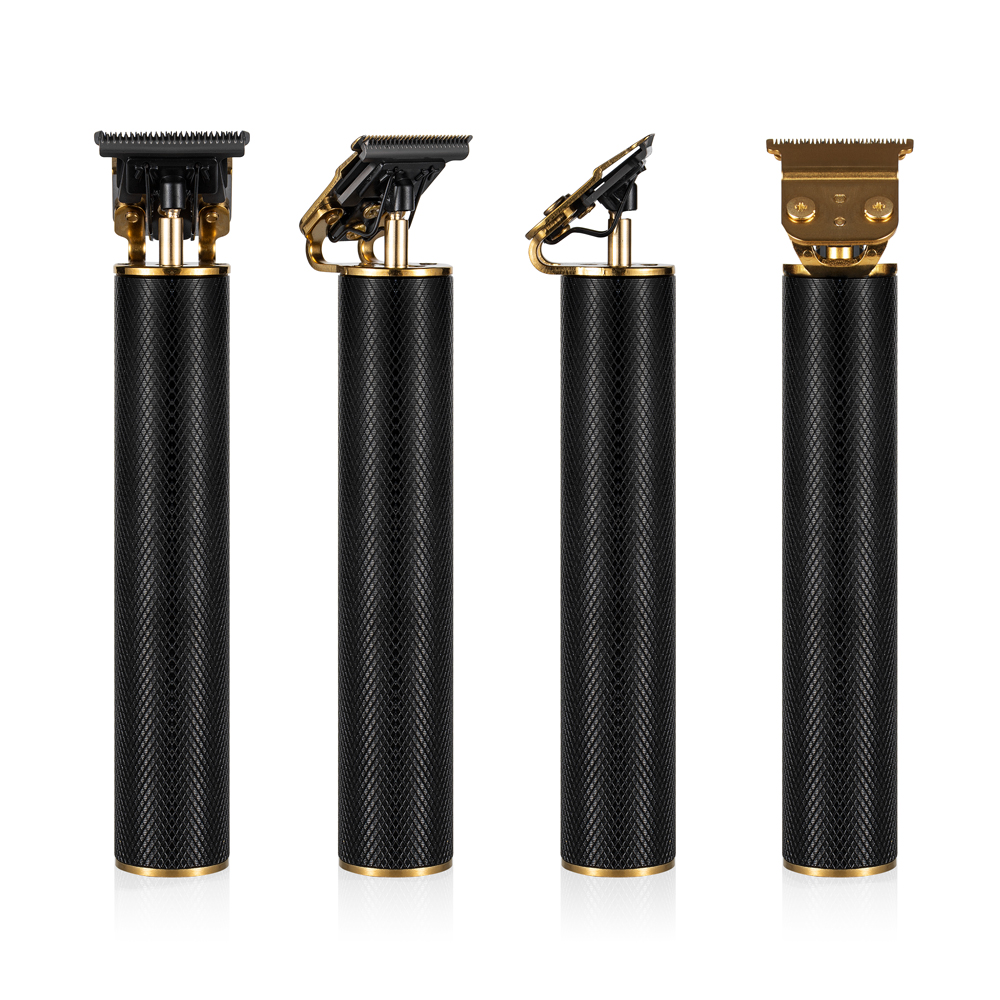
In Huux’s world of hair styling and beauty products, quality is more than a promise we make to all our clients and customers, but a discipline we follow to guarantee trustful products. We discipline ourselves with safety, high standards, and excellent performance carried out in each product. For Huux, a brand known for its innovation and customer service, meeting and achieving these demands requires more than just ideas, it calls for industry-leading organizational structures.
One of the cornerstones of Huux’s quality management is the Seven Basic Tools of Quality Control. Here in Huux, the leading beauty device hair styling tool manufacturer, we use these seven basic tools to keep our promise to our customers. Keep reading and learn more.
1. Check Sheets
Huux’s production lines rely on check sheets to record daily occurrences. A check sheet can effectively collect data and help our engineers to spot any potential quality problems. A check sheet is usually used after manufacturing for data analysis. By seeing the data collected under each criteria every day, it is easy to spot any problems with the manufacturing process and usually helps with random inspection as well.

2. Stratification
Stratification is when data is collected, sorted into categories and data processed by their common characteristics and features. It usually follows a rule of “5M1E”, that being: man, machine, material, method, measure, and environment. All of these are important and vital to ensure good quality products, as it focuses on questions like: Does your employees have enough training for their position? Are your production methods written in clear and understandable language? Or remind you of things like creating a clear measurable standard for your checkings.
3. Pareto Charts
The Pareto charts are the key to spotting critical production issues in a mixed, multi-factors, quality-considered production process. The chart itself is a combination of bar graphs and line charts. It uses a biangular coordinates system, where the right side shows on what frequency does certain incidence occurs, and the left shows how many times the incidence occurs.
It is also widely believed through Pareto charts that the most important vital key point of an issue usually lies in a small part of the issue itself, usually believed to be around 20%.

4. Cause-and-Effect Diagrams
Cause-and-Effect diagram, also known as the Fish-bone diagram, is a tool we use here in Huux to locate the core of the issue through a process of brainstorming and analyzing.
To begin dissecting the major issue, engineers here at Huux, must come up with a major issue or topic and place the problem at the head skull of your fishbone. Through a session of group analysis and brainstorming, coming up with some reasons that might lead to the cause of the issue, this will make up the bigger bones of your fish-bone structure. The last would be a series of causes that might have caused your second-degree issue, and link that to your bigger bones and make up your smaller bones of your fish skeleton.
The whole process is written and done in a group meeting session, and through brainstorming. It combines the wit of all our teams and comes to a well thought through solution of problem solving.

5. Histograms
Here in Huux, histogram, also often called as a quality distribution chart, is a simple but powerful tool for showing how data changes according to the independent variable. With a histogram, engineering teams can spot the patterns in production and product quality quickly. It helps analysts to get a clearer picture of how certain characteristics and feature are distributed and played out through certain situations. Histogram makes it much easier to rate the overall performance at just a glance.
Building a histogram involves some basic statistics knowledge. First and obvious, the data collected needs to be grouped, however, the key is how you set up and choose your statistics groupings. Typically, groups are created within equal intervals, which in histogram, is defined by two factors: the number of groups, meaning how many groups you have, and the width of each interval, it matters with the overall display of your diagram.
In display, a histogram is a series of bars drawn from the collected production data. Each bar’s bottom base, or their interval on the X-axis represents a range of values, while its height reflects how often those values occur. The result is a visual snapshot that helps managers and teams here in Huux to understand whether quality is consistent, and through its general layout, where variation occurs, also determines where improvement should be made.

6. Scatter Diagrams
A scatter diagram is a chart used to show the relationship between two factors. By plotting one factor on X-axis and another on Y-axis and thus marking the data points of production or from historical records, teams can quickly see whether there is a connection between the two factors, or in this case, variables.
In practice, if the points form a clear pattern, like clustered in a specific area or forming a visible strip, it suggests that the two factors are closely related. This makes scatter diagrams especially useful for predicting outcomes with given data or identifying the relativity of two variables. However, if no pattern emerges and the points are scattered randomly, it means the factors likely have little or no connection, and other factors may need to be tested.

7. Control Charts
Another statistical tool Huux uses to mange our quality is scatter diagrams. A scatter diagram is a chart used to show the relationship between two factors. By plotting one factor on X-axis and another on Y-axis and thus marking the data points of production or from historical records, teams can quickly see whether there is a connection between the two factors, or in this case, variables.
In practice, if the points form a clear pattern, like clustered in a specific area or forming a visible strip, it suggests that the two factors are closely related. This makes scatter diagrams especially useful for predicting outcomes with given data or identifying the relativity of two variables. However, if no pattern emerges and the points are scattered randomly, it means the factors likely have little or no connection, and other factors may need to be tested.

Conclusion
Quality is never left to chance. By applying the Seven Basic Tools of Quality, every stage of production, from sourcing raw materials to delivering finished products, follows a disciplined and transparent process. These tools give our teams the ability to see problems clearly, address them quickly, and continuously raise the standard of excellence.
For customers, this means more than just reliable hair clippers / hair dryers / hair straighteners / electric shavers / facial brushes etc; it means confidence in every purchase and trust in a brand that treats quality as a promise kept. For Huux, it reflects who we are: innovative, committed, and always striving to deliver beauty products that are as dependable as they are inspiring. Interested? Leave an online message or email info@huux.com. Our team will get back to you within 24 hours.


